Big Data Pipeline for Covid 19 Analysis
Implementing an end-to-end data pipeline on AWS using real-time streaming, Pyspark and HDFS to analyse trends and impacts with COVID-19 dataset.
Toolkit: HDFS, PySpark, AWS, Kafka, NiFi, Tableau
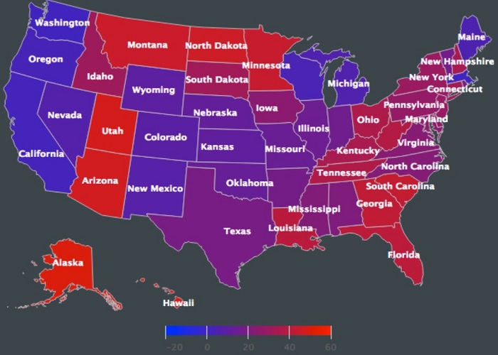
Choropleth Visualization
Interactive Map visualization of ratings of board games specific to each region.
Toolkit: HTML, D3.js
Curious to Visualize ?
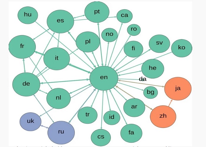
Co-actor network visualization
Building a network graph of co-actors and visualizing them as a graph.
Toolkit: Argo-lite, Python
Visualize it yourself
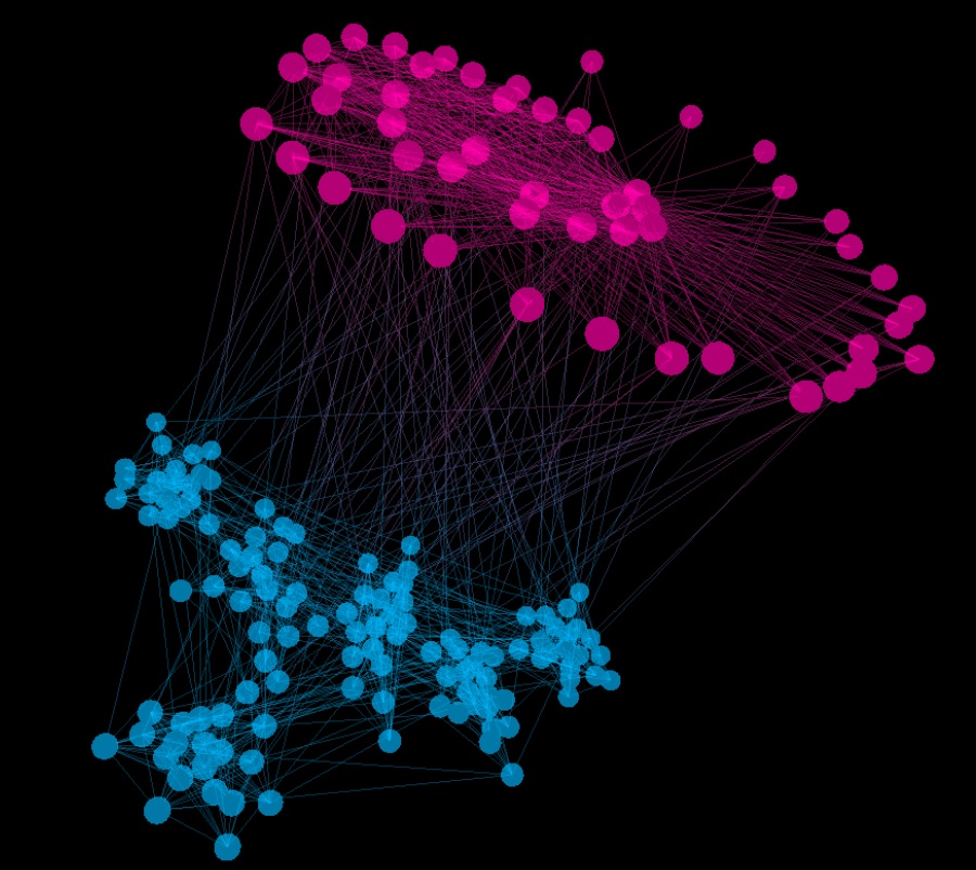
Force directed graph
A network visualization identifying similarities between board games using force-directed simulations.
Toolkit: D3.js
Curious to Visualize ?
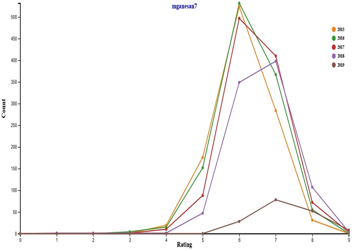
Interactive frequency polygon
An Interactive frequency polygon chart to visualize a dataset containing list of games, their ratings, and supporting information like number of user rated, year published.
Toolkit: D3.js
Visualize it yourself
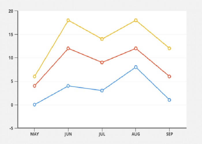
Line chart
Experimenting different features in D3 line charts for visualizing board game ratings.
Toolkit: D3.js
Visualize it yourself

